Saturday 17 June 2017

Inner Calm Stationary Set

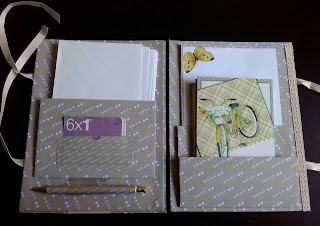
Hello everyone, today's tutorial is a stationary gift set made using the new Inner Calm Kit that Jodie has just released and as usual is available from her Etsy shop http://etsy.me/1pnMcjO


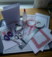
As usual we will start with an overview of the things that you will need to hand - which are

Cutting mat
Cutting blade & Ruler
Ball tool
Scoring tool
Small bladed scissors
Red Tape
Repositionable glue
Tacky glue
Clear glitter glue
Selection of ribbons
Ivory pearls
Natural effect buttons
Book of Postage stamps
Pen - I used one from my local pound shop that cost around 50p as long as you can take it apart and put it back together try to also get one that has a vertical stripe or repeating pattern on the barrel.
Prepared and printed A4 background papers x5
Prepared and printed A5 writing paper and A6 note cards (I will talk about these later)
Prepared and printed sheet with strip of complementary paper flower embellishments and journaling cards
A4 sheet of acetate
3x A4 sheets of heavy weight Kraft card


  Just a quick note about the actual stationary. It was all printed from Jodi's kit. I used magazine weight printer paper from the Tattered lace range as this takes ink well and is a nice surface to write on for the notepaper and 250gsm smooth inkjet card for the notelets.  You could just print A6 size fronts for the notelets and stick them onto card blanks if you wanted to but I chose to make my own. If anyone wants any help with doing this please feel free to get in touch.  The envelopes were just plain white ones from my stash but again you can make your own if you are so inclined.

Start off by taking your pen and dismantling it then you will need to measure down the length of the barrel as accurately as you can and cut a length of your backing paper to match and as wide as you need to wrap all the way around it with an extra 1/4" ( 1/2cm) aprox. to stick it down.

 Run a length of strong red lined tape as near to the long edge as you can. Line this up down one of the stripes - or in my case repeated chevrons - so it is exactly vertical  and firmly stick it down. Coat the rest of the paper in strong tacky glue and roll it firmly around the barrel holding it in place for a minute or so to let it grip. Re assemble the rest of the pen and put it to one side to dry completely.

Take your sheets of Kraft card and cut each one down to make your front and back cover.  I found that the width of a steel ruler removed from one long edge and one from the top and one from the bottom was perfect (told you I don't measure unless I absolutely have to!) Use repositionable glue and stick each one down to a sheet of backing paper leave to dry.


Cut around it leaving a 1" edge all around.  Fold the edges up to mark the corners snip out the corners at an angle of slightly larger than 90' run a length of red lined tape down each edge fold over and stick neatly. You now have the front and back covered inside ready to add the stationary pockets.

Take your third sheet of Kraft card and cut two pieces that measure 6"x4" (15cm x 10cm) and one 6"x2.5" (15cm x 6cm) using the same method as above cover these with your backing paper.  You could just stick these into place on the front and back as they are but I have found that doing it this way makes it difficult to slide your actual stationary in so we are going to make acetate 'hinges' so that the pockets stand proud and give us the room needed.  You need to cut strips of acetate as follows
2 x 6"x2" - score these longways down the middle
2 x 1cm x 5cm - score these short ways at 2cm and 3cm
1 x 1cm x 4.5cm - score this short ways at 2cm and 2.5cm
(I am sorry about the interchanging of inches and cm but this is how the measurements work out without having to go into using quarters and eighths etc which I thought would be even more confusing!)  I won't add a picture here as acetate is neither easy nor interesting to photograph!
Take one of the larger pockets and the smaller one and one of the 6"x2" strips of acetate and using strong liner tape throughout this section.  Making sure you have everything with the right sides facing and any pattern in the right direction stick the strip of acetate to the back of the small pocket lining the long edge up exactly to the front of the folded edge of the acetate, stick the large pocket with the long edge pushed snuggly down into the inner fold of the acetate so you should now have a hinge 'sandwich' that goes, with all the patterns front facing and in the right direction, small pocket, acetate, large pocket, acetate.


Take two of the 5cm strips and the two 4.5cm ones as these are going to hold our pockets proud from the back of the wallet. Run tape along the 2cm sections so you should now have two strips that go 2cm taped 1cm no tape 2cm taped and two strips that go 2cm taped 0.5cm no tape 2cm taped. Fold all the strips at the score lines to produce three sides of a cube shape. Carefully stick one of the larger tabs to each end of the back of the small pocket long edge, opposite the hinge, then stick to the front of the larger pocket so it now stands proud at that long upper edge Attach the smaller tabs to the back of the long edge of the larger pocket but leave the last little bits of tape on until we have positioned it on the cover. Run a strip of tape along the back bottom edge and carefully line it up straight about 1cm up from the bottom edge of the back cover centering it remove the tape from the last two tabs and press them down gently. I then use a flat scoring tool just inside the pocket to press it down firmly without flattening the hinge completely.

Taking our other cover we are going to put the remaining larger pocket together in exactly the same way (omitting the smaller pocket instructions - as there isnt one!) but for now leave all the red tape liner on as we need to add the pen holder first.  Cut a piece of acetate approximately 2"x3" and gently fold it in half without scoring or pressing it down as we dont want a definite fold more of a hammock. Slide your pen in and check that it is tight enough to hold it in place but not too tight that it wont slide easily in and out - stick the long edges together. Place another length of tape along the same long edge and position the holder horizontally about 1cm up from the bottom of the inside front cover stick down.
        
Remove the backing from the pocket tape and centering it stick it down making sure you cover the workings of the pen holder.

  I have added a small pocket to hold a book of stamps to the front of this simply by cutting a small piece of backing card to size rounding the corners and I used a circle punch just to take out a semi circle on the top edge just as a design feature.

Place your front and back covers side by side insides (finished sides) facing you one at a time turn them over bottom to top so that the back (unfinished sides) are facing you taking care not to twist or rotate them in any way as this will result in you joining them together incorrectly (as I found out!). Cut a strip of acetate approximately 3cm wide by the length of your covers top to bottom use strong tape and stick it down leaving a 1cm gap between the two covers to form the spine of your wallet.

Cut your remaining two sheets of backing paper to the size needed to cover the front and backs plus 1" extra all around. Snip the corners out and using strong tape fold and stick the excess down onto the back of the backing paper forming a nice tidy folded in edge all around instead of a sharp cut edge. Put to one side.  To make the ties choose a piece of woven ribbon to taste - please don't use organza style ribbon as no matter how you cut it or try to bind the end it will unravel with use and spoil your gift - and cut 4 lengths each approximately 1.5 times the width of your wallet and attach them using your prefered method of either wet glue or tape about 2" from the top and bottom edges. (If you use tape don't forget to remove the backing tape even though it will be covered as in time it may lift and move spoiling the look of your cover) Making sure you have the back outside cover facing you stick down your backing paper covering up all your workings neatly.


The final thing left to do is to decorate your front cover.  You can do this however you want but I will go through my design with you.  I always decorate the backing paper before I stick it down as this allows you to tuck any ends in and get a neater finish and I always do a couple of 'dry' runs without glue or tape to be sure everything goes where I want it to.
I chose to create my design across one corner as I find it easier than trying to do than in the middle of a relatively large space. I started by using a piece of paper printed from the kit that was plain but picked up one of the colours in the backing paper as this helps the decoration to stand out against the background. I added a length of lovely crochet effect cream lace from my stash which I cut and then pulled a little with my nail so it didnt look too perfect. I printed off three of Jodi's journaling cards (odd numbers work best) and arranged them a couple of times until I was happy with how they looked.  I cut out and arranged some flowers from the embellishments in the kit and used my ball tool and foam mat to add form and texture to them then arranged them adding some small fabric leaves again from my stash. To finish them off I added some small ivory pearls and some clear glitter glue to the centers just to add another texture. Finally I put three wooden buttons down the spine edge, this picked up on the dotty background and also extended the decoration across the whole of the front cover without it being too fussy.
Once all the glue is fully dry cover the back with repositionable glue and run strong tape around all the edges and place over the front cover leave to completely dry.

   
There we have a lovely stationery wallet set which I hope you will agree would make a lovely gift and was fun to make.  As usual if anyone has any questions please feel free to ask and do pop over to Jodi's Etsy shop and have a look at all the lovely kits etc that she has there.

by for now Karen xx

Thursday 1 June 2017

My Lil' Girl project - Wall plaque

Hello everyone here we are again with another tutorial for a project using the My Lil' Girl digi art kit.


Hello everyone here we are again with another tutorial for a project using the My Lil' Girl digi art kit. This beautiful kit is actually a collaboration between Jodi - Throwing Some Scraps Around (TSSA) and Dana - Made By Keuntje (MBK) and is available from either of their Etsy shops
TSSA: http://etsy.me/1pnMcjO

This time I will be making a wall plaque to match the new baby card that I produced last time from this lovely versatile kit.


You will need
Pre Cut MDF Plaque
Prepared printed sheets of backing papers.
Prepared printed elements sheets with two copies of the 'First Steps' word art with 'organza' frame.
Strong Tape
Repositional Glue
Extra Tacky Glue
Ruler & Cutting Blade
Ball tool & Foam Mat
Score Tool
Sharp paper scissors
Pink Ribbon
Corner Rounder punch

I used an MDF pre cut plaque with a frame element that was purchased for £1 from a local independent craft store (can I take this opportunity to ask you to please use these local hero's if you have them) and background papers and elements sheets produced from the kit. A tip here regarding your choice of backing papers - if you are at all anxious about measuring or cutting please avoid stripes (including rows or repeat patterns ie spots) and checks on this type of project as even the slightest skew or mis alignment will really stick out in this case go for a plain background or a random pattern.


I wont give measurements specific to my plaque as yours may not be the same size etc but rather size comparisons as you will see.  So measure your plaque and cut a piece of your chosen backing paper that measures 4cm bigger ie: 15cm x 15cm plaque = 19cm x 19cm paper. Using a soft pencil (this will mark your paper less and be easier to erase later) lay a straight edge from corner to corner and mark a small line - not a dot - roughly half way along.  Repeat with the other two opposite corners so you now have a cross that shows the centre point and extends towards the two opposite corners.  Taking your plaque measure corner to corner across the inner section - do this both ways just to check that it has been cut squarely! Work out the half way measurement had measure and mark from the centre of your backing paper out towards each corner when you join these marks you will have an inner square that should exactly match the inner square on your plaque and an outer frame both of which should both look exactly square with your backing paper design.  Use a cutting blade and ruler to cut corner to corner across the inner square and a scoring tool to gently score around the four sides. 


Run some repositional glue along the inner edge of the frame section and the outer edge of the inner square.  As your plaque is made from MDF it does tend to soak up the glue a little so you don't have the same maneuverability which can make this step a little tricky but don't panic (or you will probably fumble and rip or crease your paper!) just gently but firmly lay your paper centrally over the inner square and press it into place using either your finger or a rounded scorer or lolly stick to smooth it down. Your cut cross will open up slightly to allow the paper to fit snugly into place.  Once the glue has stuck firmly put a small piece of double sided tape on the underside of the points to hold them down.


Turn the plaque over and easing the excess paper over use strong tape to stick it down neatly on the back trimming the corners neatly - on this project the corners wont be visible so as long as they are tidy it does not really matter what method for creating them you use, I snipped in from the corner of the paper diagonally to the corner of the plaque and neatly folded them in. Looking back at the front gently erase any pencil marks (please get into the habit of doing this every time even if you are certain that they won't show).


Take your piece of ribbon - I measured it by eye but roughly twice the length of your plaque - and fold it in half, this will ensure that you don't get any twists in the ribbon, use extra tacky glue to stick it roughly one quarter of the way down the plaque use the design on the paper to line it up level or if you have nothing to line up with measure it. Remember you are making a gift or a piece of home decor don't get too hung up on numbers as long as it looks how you want it to look.


Cut a second piece of backing paper this time measuring 2cm larger than your plaque and gently score 1cm in down all four sides.  At each corner you will now have a small square marked out ready to snip out in order to make sure the corners are neat.  I always cut slightly outside of the score lines as this means you get not overlap and therefore bulk to deal with at the corner.


Fold the edge onto the back and use double sided tape to stick it down.  This has now formed your backing panel which will hide all your workings - if you wanted to omit this stage you could do but especially if you are giving this as a gift I think it is well worth the minimal effort involved in making it. Again use strong double sided tape to stick it in place on the back of the plaque.


Take your elements sheet and cut out the two copies of the word art.  When you are preparing these sheets to print you should ensure that the inner panel with the actual words on measures the same as the inner panel on your plaque. Take your first copy and using your blade and ruler cut the word panel exactly out of the centre and use the corner rounder punch to neaten the corners. Use your sharp paper scissors to cut out the 'organza' frame - try and use sweeping scissor moves turning the paper not the scissors rather than snipping as this will give you a more natural edge. 


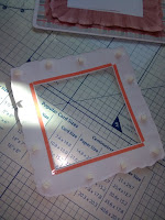
Now take your second copy and again remove the word panel but this time leave a small - 2mm - lip on the inner edge of the 'organza'.  If you look carefully on the frame you will see where there is an inner and outer layer of 'organza' and this time cut on the inner line don't panic if you don't hit the lines exactly you won't notice once it is layered up. Use your ball tool and foam mat or your fingers, which ever you feel most comfortable with, 
to gently create the up and down ruffles in the frames.


Take the wider frame and run double sided tape around the back inner edge and carefully stick it onto plaque. Take the narrower frame and this time run your tape around the inner edge but remember to leave the 2mm lip free. Carefully stick the 2nd layer down square over the 1st layer. 
At this point in doing my project for you I noticed that I had actually stuck the top layer down and produced a crease - PANIC!! No there are lots of lovely flower elements in this kit that are just what I needed.  I printed and cut out three flowers (always try to use flowers in odd numbers as it just looks better) and two leaves.


Again I used the ball tool and mat to add texture and form to these and positioned them on the frame over the crease.  In this instance I chose not to add any glitter or pearls etc to the flowers as it is intended to go in a babies room and at a later time I wouldn't want any thing on there that could cause a choking hazard.
Finally take the prepared word art panel and gently ease it into the frame. It is important not to stick the panel down at this point although you could use one small sticky pad if you feel that this is necessary.
There you are a wall plaque that matches your welcome card and because the word art isn't stuck down at a later date it can be gently eased out of the frame and used as a template to be replaced with a photograph of those precious first steps.


If you have any questions or comments (good or bad) or suggestions please feel free to ask or post them and I will respond as soon as I can.

bye for now Karen xx
Tuesday 23 May 2017

My Lil' Girl Project - New Baby Card

Hello everyone well here goes my first actual project blog. I hope you all enjoy reading it and even learn a little something from it.

This beautiful kit is actually a collaboration between Jodi - Throwing Some Scraps Around (TSSA) and Dana - Made By Keuntje (MBK) and is available from either of their Etsy shops
TSSA: http://etsy.me/1pnMcjO
MBK: http://etsy.me/2ikOlxy

So lets start with a general run down of what you will find useful to have to hand.
A4 sheet of 300gsm white card
Printed off design sheets
6" x 6" white card blank
Scissors
Foam Mat
Large Ball tool
Wet re-positional glue
Strong red lined double sided tape
Foam double sided tape
Foam double sided sticky pads
Metal Ruler
Glass cutting mat
Corner Rounder Punch


This particular card is an easel style so I am using a 6" x 6" size card blank as once it is completed because of the way the card is displayed it actually appears to be bigger and more substantial than it actually is.

Begin by cutting a piece of the plain white card to measure 6" x 6" for your front and use your corner rounder to round off the corners of this, your card blank, your main image for the front of the card and your insert image.  These two images were printed off at 5.75" x 5.75" so  I had a small white boarder all around them.
I would usually mat the front image onto a piece of mirror card but as this is for a new baby I chose to keep the look clean and simple and stick to white. These pieces can then be put to one side.

Next cut out the images that will create the 3D elements of your design - in this case two layers of 'organza' and the footprint topper and the four pieces that will go together to produce the ribbon that makes up the easel stopper. Use super tacky glue to stick your ribbon pieces together and use paper clips to hold them until they are securely set. Again put to one side.
We can now begin to work on the front topper of our card. Taking the two images of the 'organza' cut them out then cut out the centre white squares but leave a small white edge as this will help you to create depth when you stick them together.


Using your foam mat and a larger ball tool work your way around them one at a time gentle pressing down the darker areas of 'organza' to create dips then go around again gently curving and shaping the lighter areas of 'organza' so eventually both pieces have a natural wavy look.
You can use your fingers to manipulate the outer edge into a slight downward curve to create extra depth. Always be careful to work gently with paper in this way so that you do not actually crease it at all and the actual heat from your fingers will do much of the work for you. Taking your footprint topper use your ball tool and gently run around the back edge, again creating a gentle downward dip to give depth. Using narrow red lined tape stick your front image onto the 6" x 6" square of plain white card making sure you leave an even white edge all around it. (You may prefer to use re-positional wet glue for this stage as it will allow you time to adjust your image if necessary).  Take the slightly larger 'organza' frame and place red liner tape around the back inside edge, line it up with the inner edge of the frame on your main front image and stick down. Take the second slightly smaller 'organza' frame and again apply narrow tape to the back inner square edge then add a few small double sided pads around the centre of the frame.
Line the inner edge up to the inner edge of the first layer and stick firmly down flat then remove the backing of the pads and stick these down. This double sticking method produces a 3D effect that allows you to see the different layers of 'organza'. Finish your front off by running double sided foam tape around the back outer edge of the footprint topper and placing it squarely on the center of the front covering any raw edges on the frame layers. Put your completed front to one side.

Taking your card blank place it with the folded edge across the top, open it up and fold the top section down towards the centre, gently but firmly run a scoring tool across the fold to create your easel without adding any creases. Using strong tape stick your completed front onto the front of your card lining up the lower edges and sides. Remember you are only sticking the bottom half of the topper to allow it to stand as an easel.  I find the easiest way to make sure that I get this correct is to apply the tape to the actual card blank and not the topper.
Open your card up and using strong tape on the back of all four edges stick the insert of your card down making sure that it is placed centrally with an even edge all around it.
Take your now stuck and dried paper ribbon and using wet re-positional glue place it above the sentiment (my own in this case) and the word art to create your easel stopper.

That basically is your card finished. When it is standing there is plenty of room on the back for the sender to write their message. In this instance because there is a certain amount of depth to the stopper that you wouldn't want to flatten if I was giving the card by hand I would use a slightly over large (7" x 7") envelope which would expand to accommodate the extra depth.  If I was going to post it I would use a presentation box which can be readily purchased or there are many online tutorials enabling you to make your own quite easily.


There we go a pretty little card to welcome a new baby girl into the world.  Watch this space for my next project which will be a small matching gift.

If you have any questions or comments (good or bad) or suggestions please feel free to ask or post the and I will respond as soon as I can.

bye for now Karen xx


What's in a Kit?

Hello again, before I post my first blog proper I just wanted to pass on some general information that will apply to all my projects.  First of all the projects shown here will be about using the kits in ways you may not have thought of and as such are not really about the design process of any of the papers etc. With this in mind I will be concentrating on the actual cutting and sticking etc that happens after the design has been produced. If you do have any questions about the designs or the whole design process please ask and I will always do my best to provide either answers or at least point you in the direction of whatever help I can.
I use a program called CRAFT ARTIST PRO 2 which is by Serif and available from a site called Daisytrail in both trial and full versions - http://www.daisytrail.com/ - this site is not only a mine of information about the program but also has an amazing community of unbelievably talented digital crafters.

All the papers and paper elements etc will be printed from kits designed by Jodi Tucker-Watson and are available from her Etsy store Throwing Some Scraps Away unless otherwise stated.

For those of you that like the technical stuff about the general kit of tools and materials that I use here goes. I am sure that you will probably have a basic set of tools that you use regularly and I have tried to stick to these items - there is nothing worse in my experience than to get part way into a project and find you need a specialised bit of kit that can't be substituted. I would always say that very few tools or materials are totally indispensable you can almost always find a substitute.
I use two printers, a HP purely because of the economy of ink and I like the quality of the printing and a Canon as it handles 300gsm+ card better being a top loader. Whenever I am asked about paper I honestly believe it is a matter of trial and error until you find a range of papers of finishes and weights that suit you and your printer for your particular project. I use a super smooth paper/card that can be printed on both sides, 160gsm for backing papers and toppers etc that are going to be matted and layered, 200gsm for decoupage and 3D work and 300+gsm for construction work but again I would stress that these are just my personal preference and please use whatever works for you.
The rest of my tools are pretty standard to most crafters, (except that amazing tool that was advertised as indispensable and three months later I can't remember what it does, how it does it and moreover why on earth I bought it!!) Briefly I believe that a basic kit should probably have :
Wet Glue - various including Extra Tacky and re-positional, silicone/gel styles for decoupage and spray is always handy.
Double sided Tape - various widths, flat and dimensional foam as well as the strong type usually on a red coloured carrier.
Double sided sticky Pads - various sizes
Scissors - various sizes find ones that you are comfortable using and sit nicely in your hand. I have long blades for general paper cutting, small 3" blades for detailed work and very small nail scissors for particularly intricate work.  My top tip for scissors has to be please make sure you have separate ones for cutting anything that is remotely sticky and never try and cut paper with these as you will never get a clean cut.
Cutting blade
Cutting mat - either self healing or glass
Scoring tools
Score board - I use a 12"x 12" one marked in inches on one side and cm on the other
Ball tools - various sizes for shaping paper
Foam mat - for shaping paper
Metal or metal edged ruler
Cocktail sticks - lots of uses but especially good for putting glue onto small pieces.
Tweezers - I prefer the longer ones with curved ends
Pencil, Pen and a clean white eraser
Paper clips/Pegs
Corner Rounder Punch - although this is not essential and you could craft your whole life without using one I really wouldn't be without mine
Piece of natural style sponge - again not essential but I find it the absolute best thing for applying inks to edges and for distressing papers.
Hole punch

So there we have it my very general basic papercraft kit. As I said earlier don't be put off if I appear to use something that you don't have, look around and I am sure that in most cases you will find something that does the job for you just as well and indeed it may work even better for you.  If you need a piece of equipment that I feel you may not have for a specific project I will always state it at the beginning and where necessary if there is a specific brand or type of embellishment etc used I will mention this although most of what I use is actually from my craft stash and its brand/original place of purchase have been lost in the annals of time!

Most of all don't stress about it remember we are here to have fun - so relax and enjoy your own creative journey remember there are no mistakes just happy accidents! xx


Friday 12 May 2017

Hello


Hello everyone - how exciting! I have been asked to create a blog by the lovely Jodi Tucker-Watson at Throwing Some Scraps Around.
My name - as you probably guessed! - is Karen and I am Jodie's official hybrid crafter which basically means that I get to cut n stick n generally play with her beautiful digital kits first - lucky me! I started paper crafting around 10 years ago after a lifetime of trying any and every craft as I came across it.  I came across digital crafting quite quickly and found that it really appealed to me as whilst I can design and seem to have a good eye for layout and colour etc I cannot draw at all. Eventually however I found that whilst I got a great sense of satisfaction from all my design projects I wanted to do more than just post them to the internet and wave a fond farewell, so I started printing them off and simply matting and layering them onto card blanks. Of course my inner child soon escaped and I introduced digital artwork to cutting and sticking - hey presto hybrid crafting! The rest as they stay is history.

My first blog will be posted very soon with a little project that I hope will inspire you all to think a bit outside the box when you have your digital kits and use them in different ways, but most of all to have fun with them.
Jodi has an Etsy sellers page called
Throwing Some Scraps Around by Digital Designs by Jodi
https://www.etsy.com/au/shop/DigitalDesignsbyJodi?ref=l2-shopheader-name
which is full of beautiful complete digikits, layout templates and mini kits amongst other scrapbooking delights.